DEVIALET
Product design 2017
THE CONTEXT
In 2017, Devialet was looking to refresh his mobile app. At the time, its experience was quite deceptive compared to the Devialet Phantom quality. The app strategy was not quite working with the current UX and the lacks of UI make all the brand looks far from anything you’d spend 2000$ on.
THE PROPOSAL
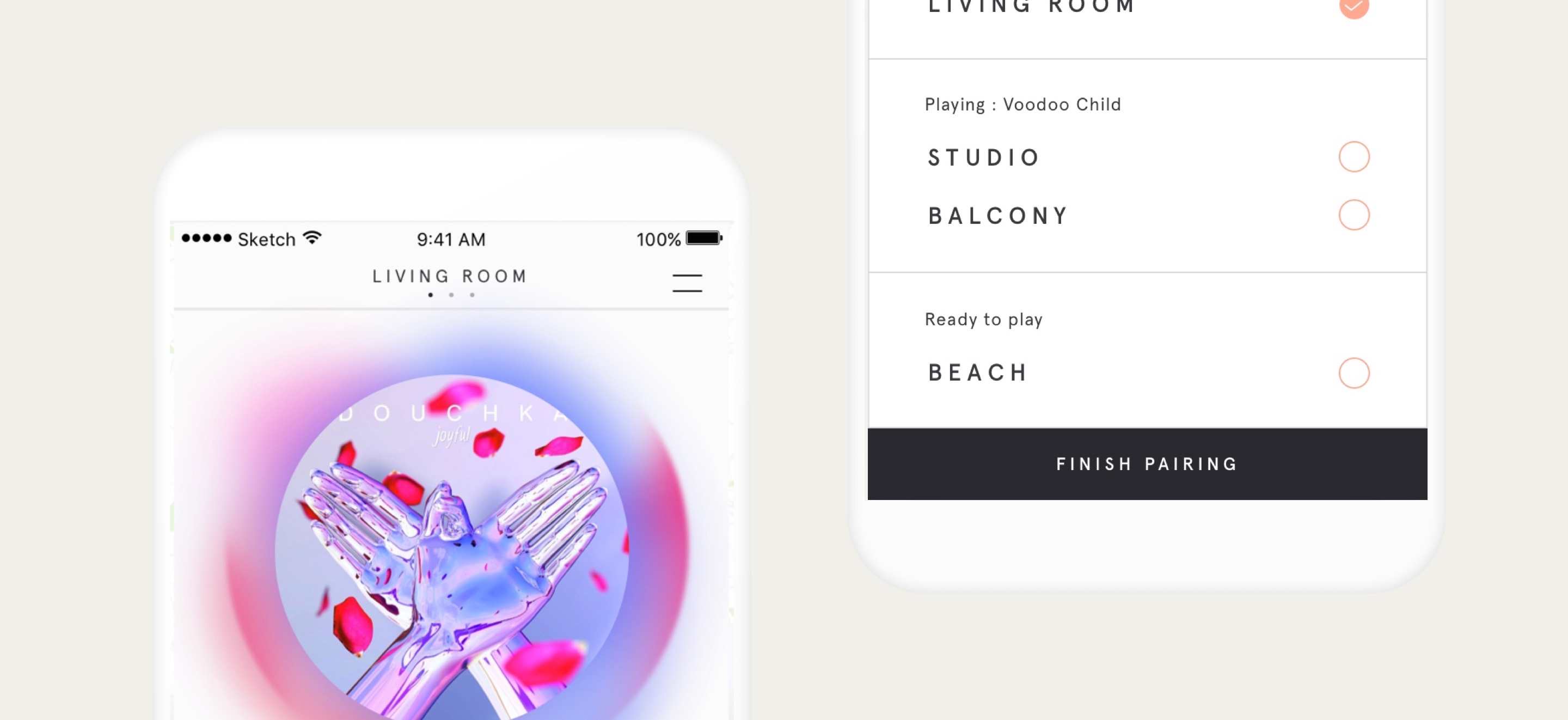
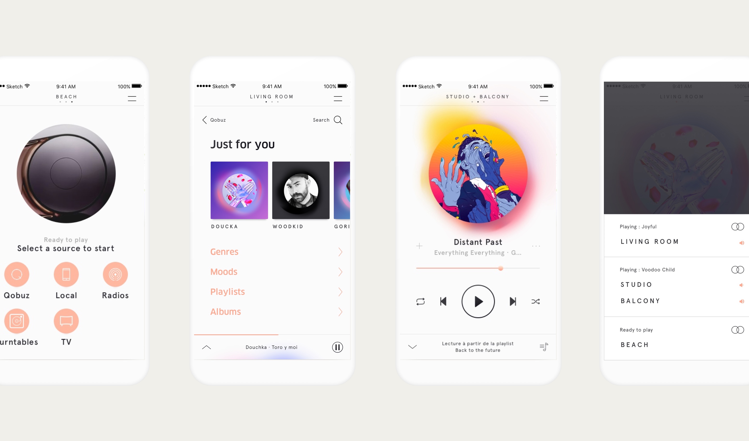
A significantly simplification of the comprehension of how the app works between your speakers and your sources, supported by a solid and minimalistic UI putting ease of use, perfectionism and personnalization at the core of the new product.
LITTLE EXTRA
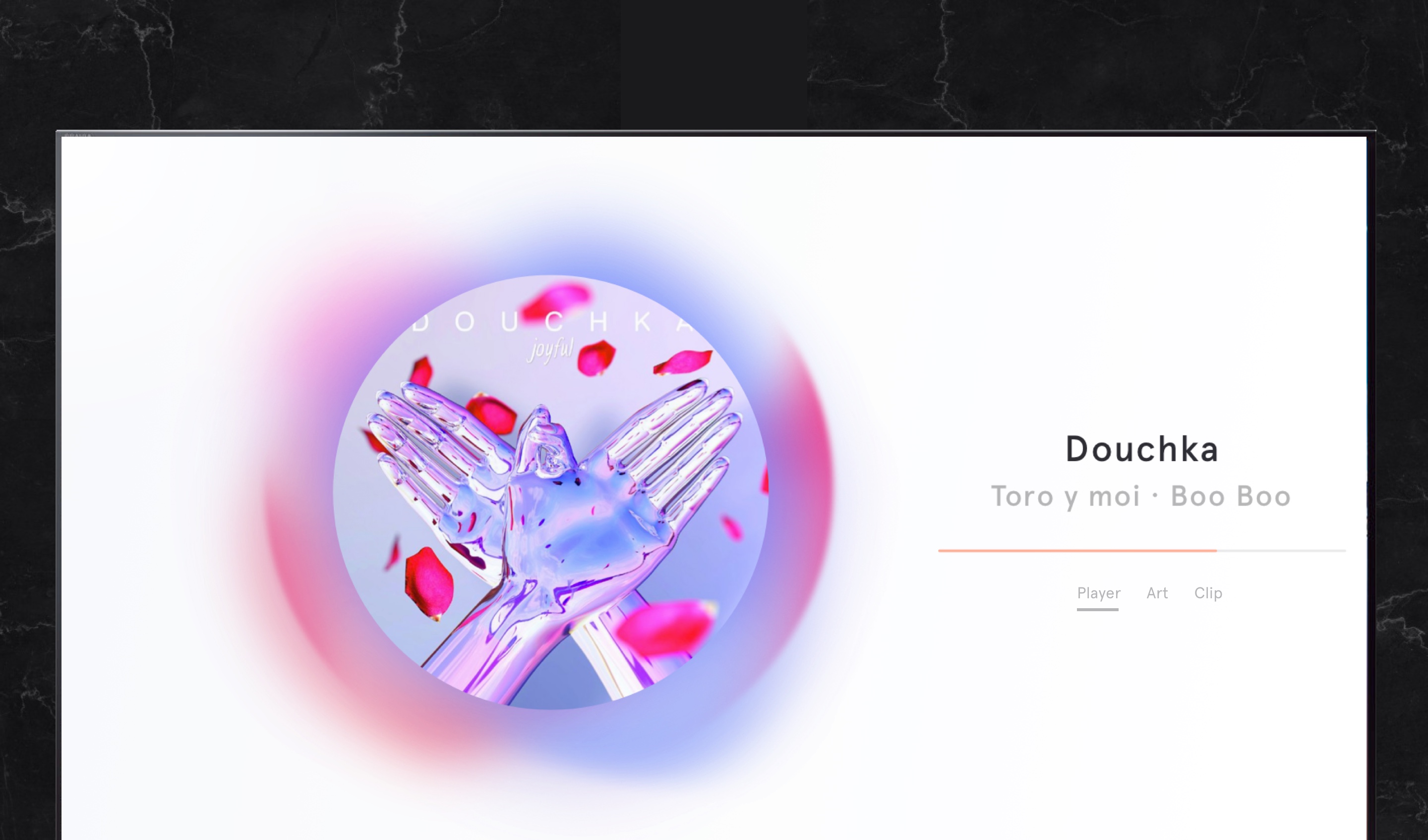
Devialet technological solution bring a clarity in sound listening to is users. Wether they’re at home or at the bar, if the tv is set, why not used it to emphasized the mood of the songs without the distraction of videoclips ?